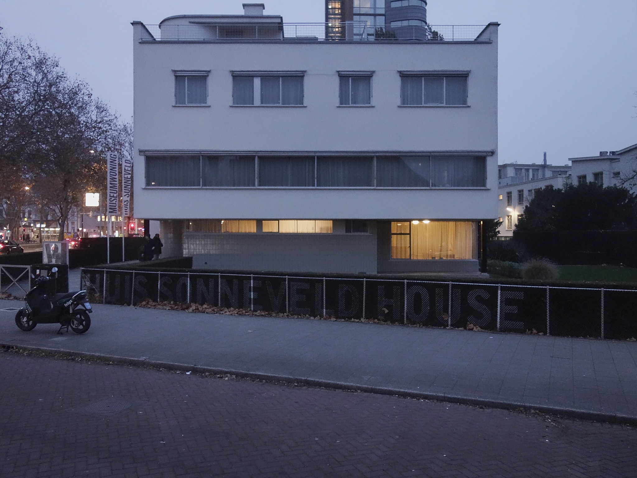
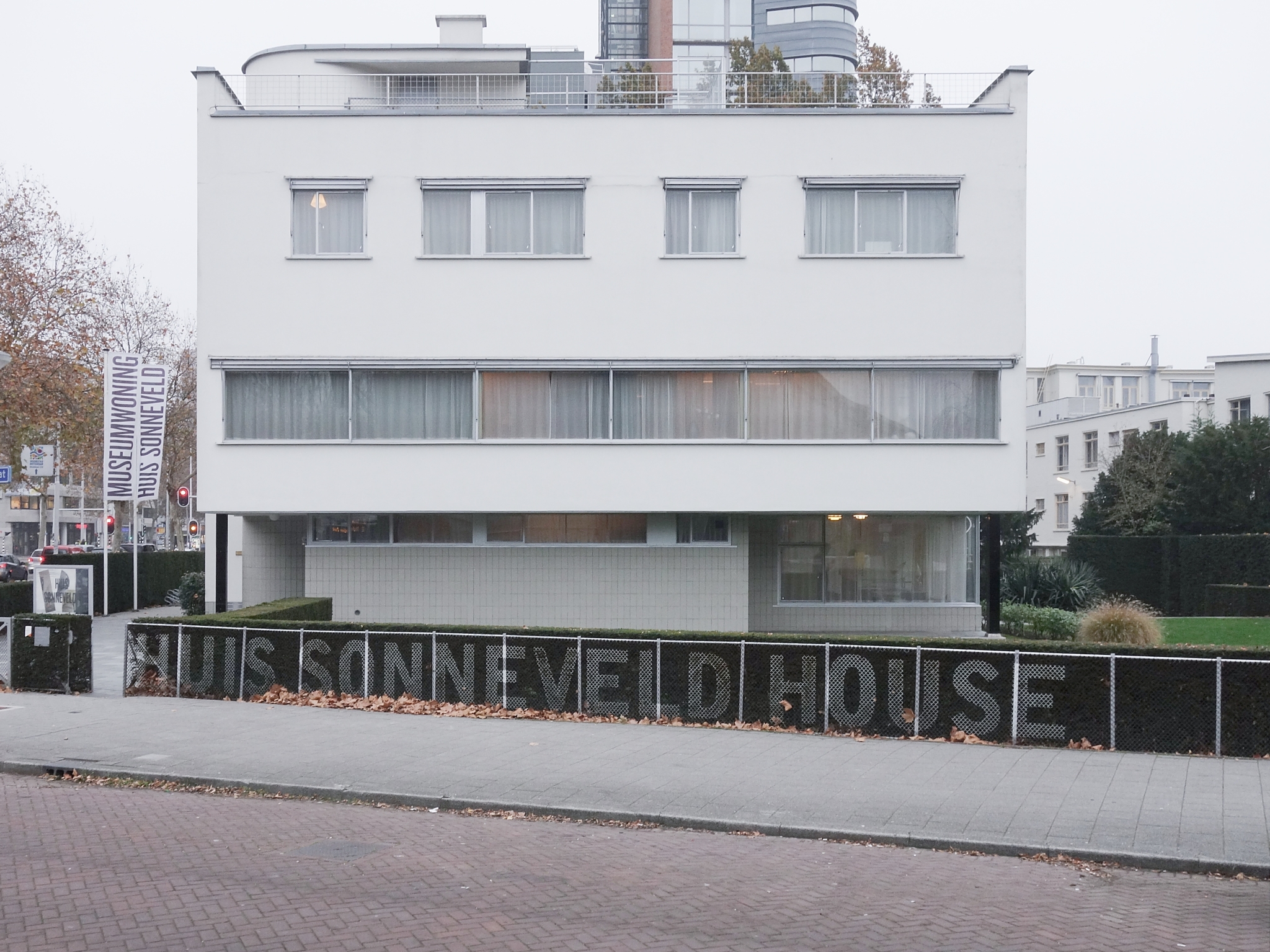
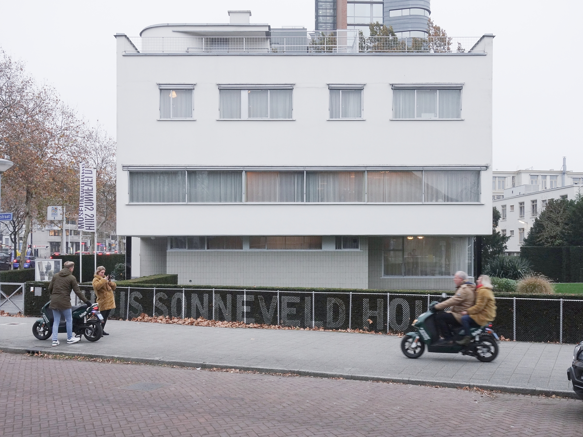
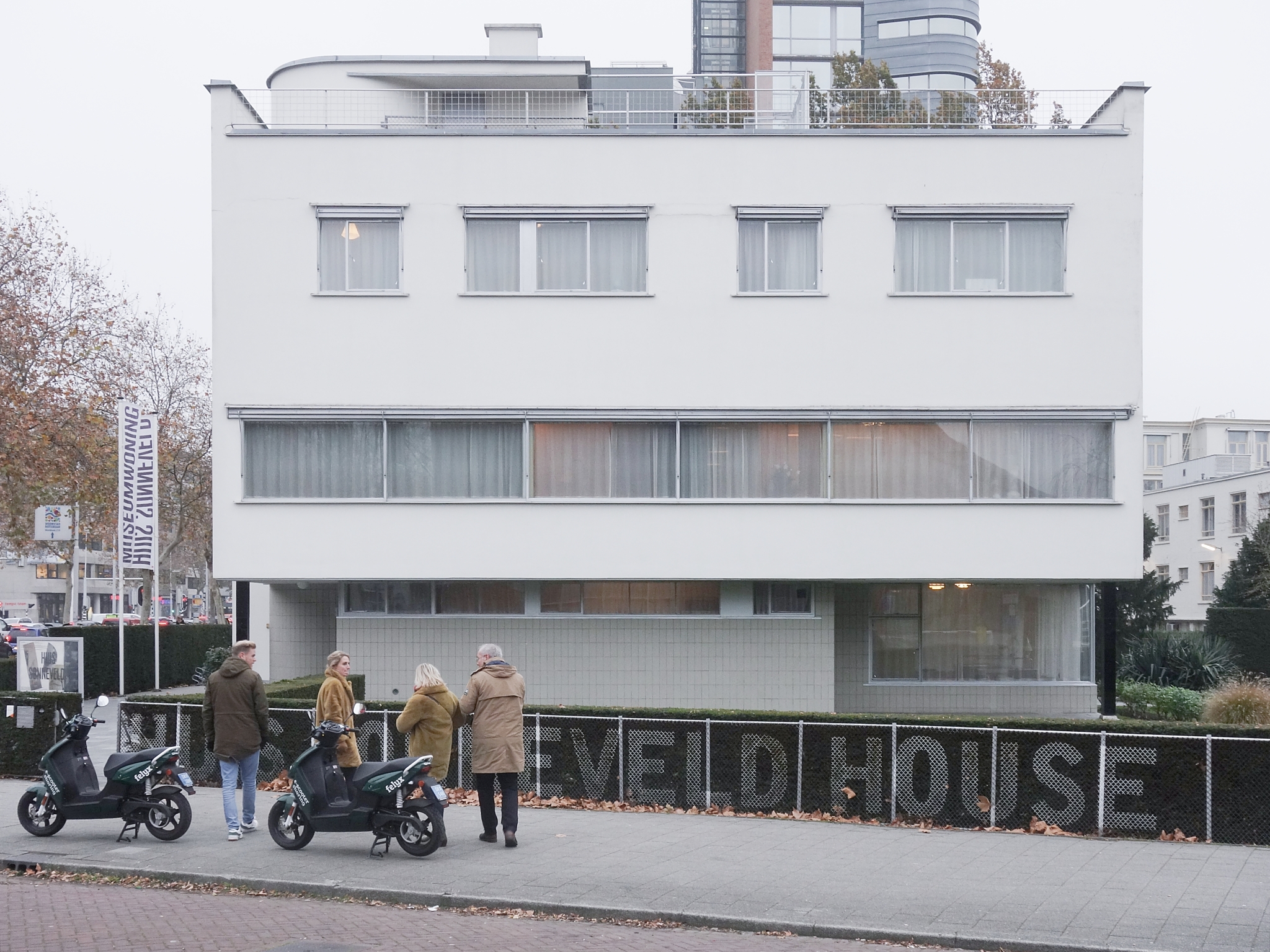
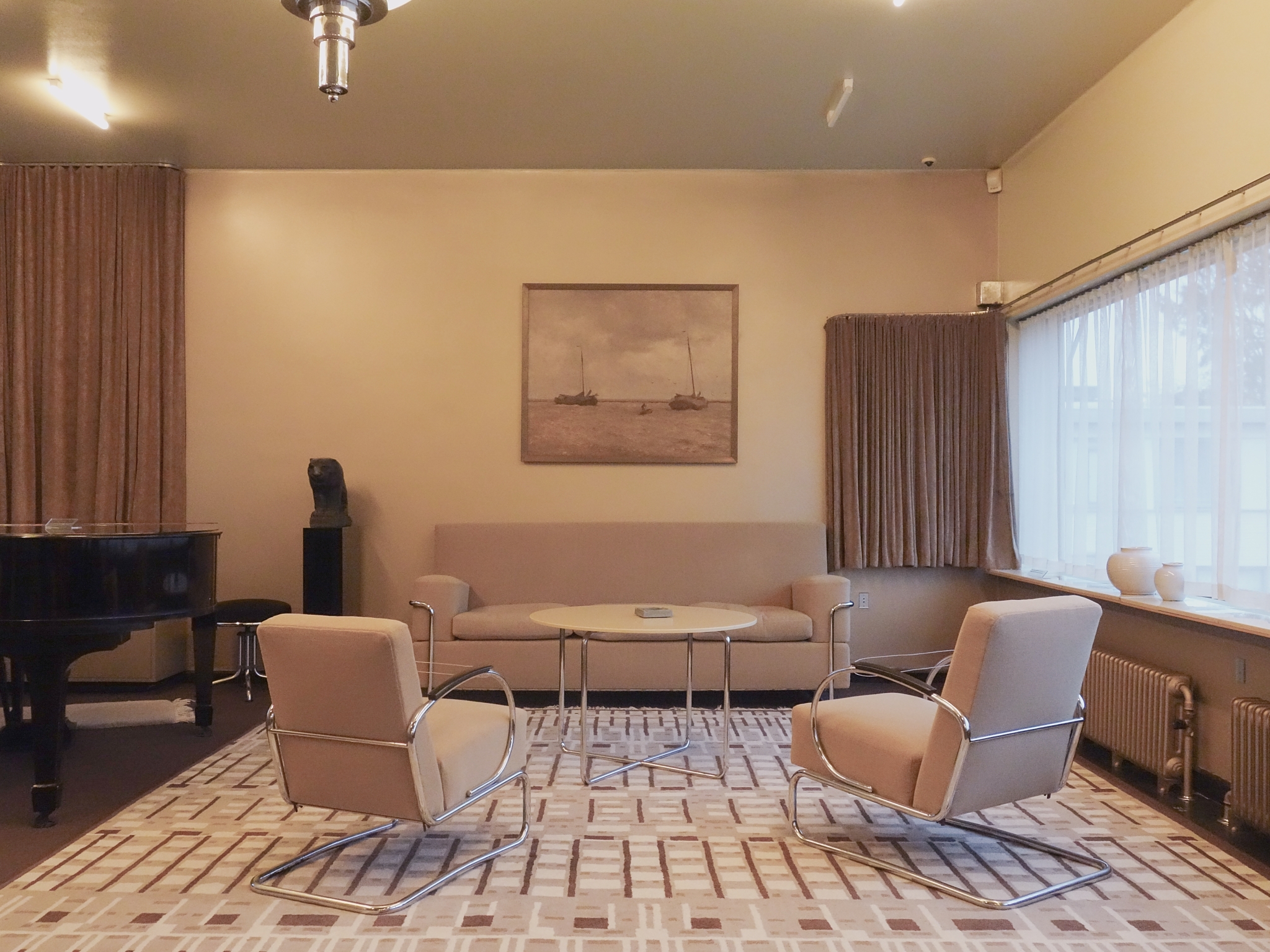
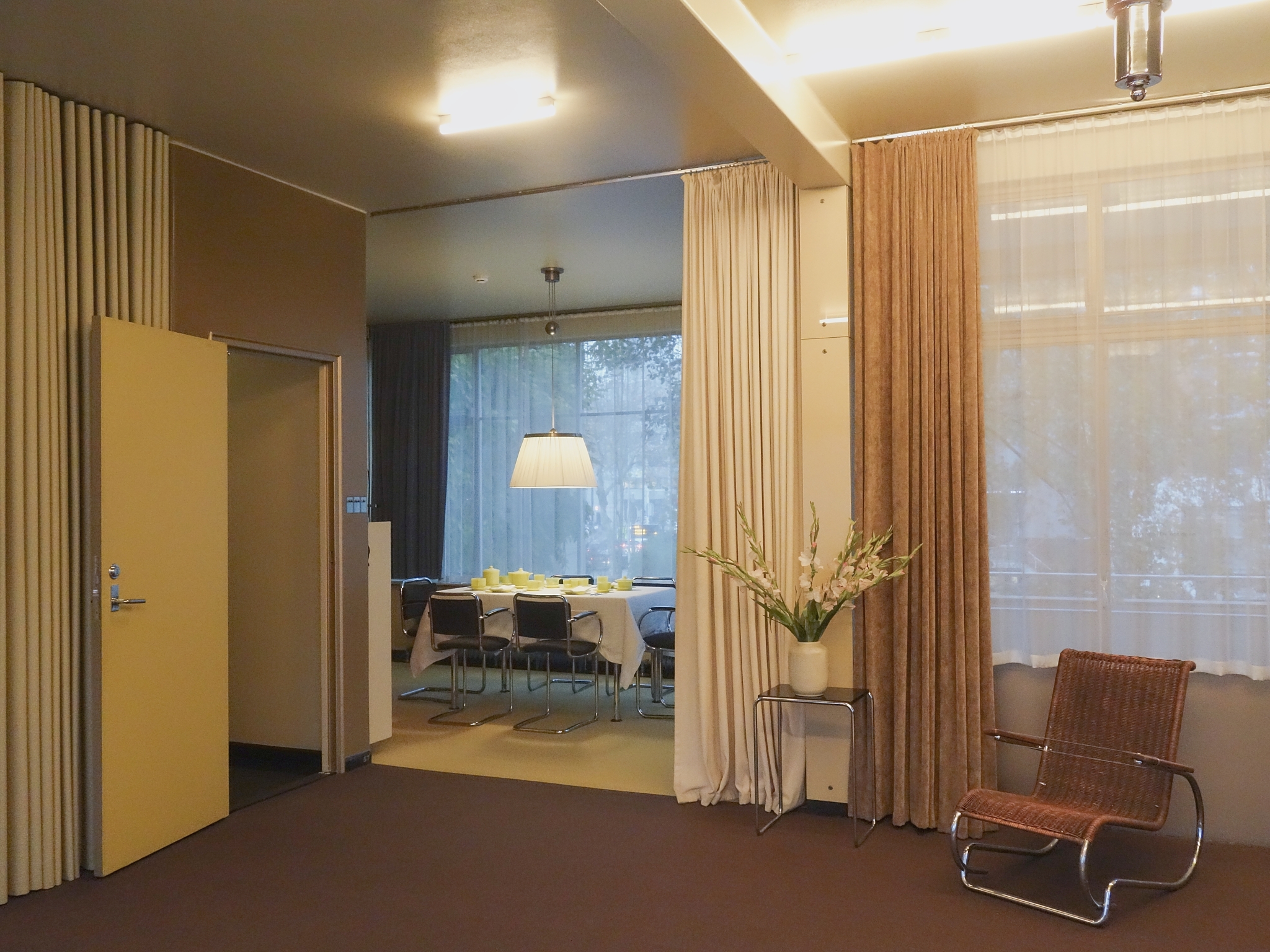
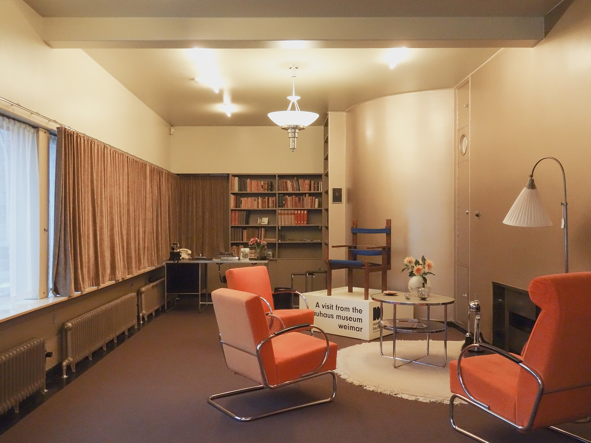
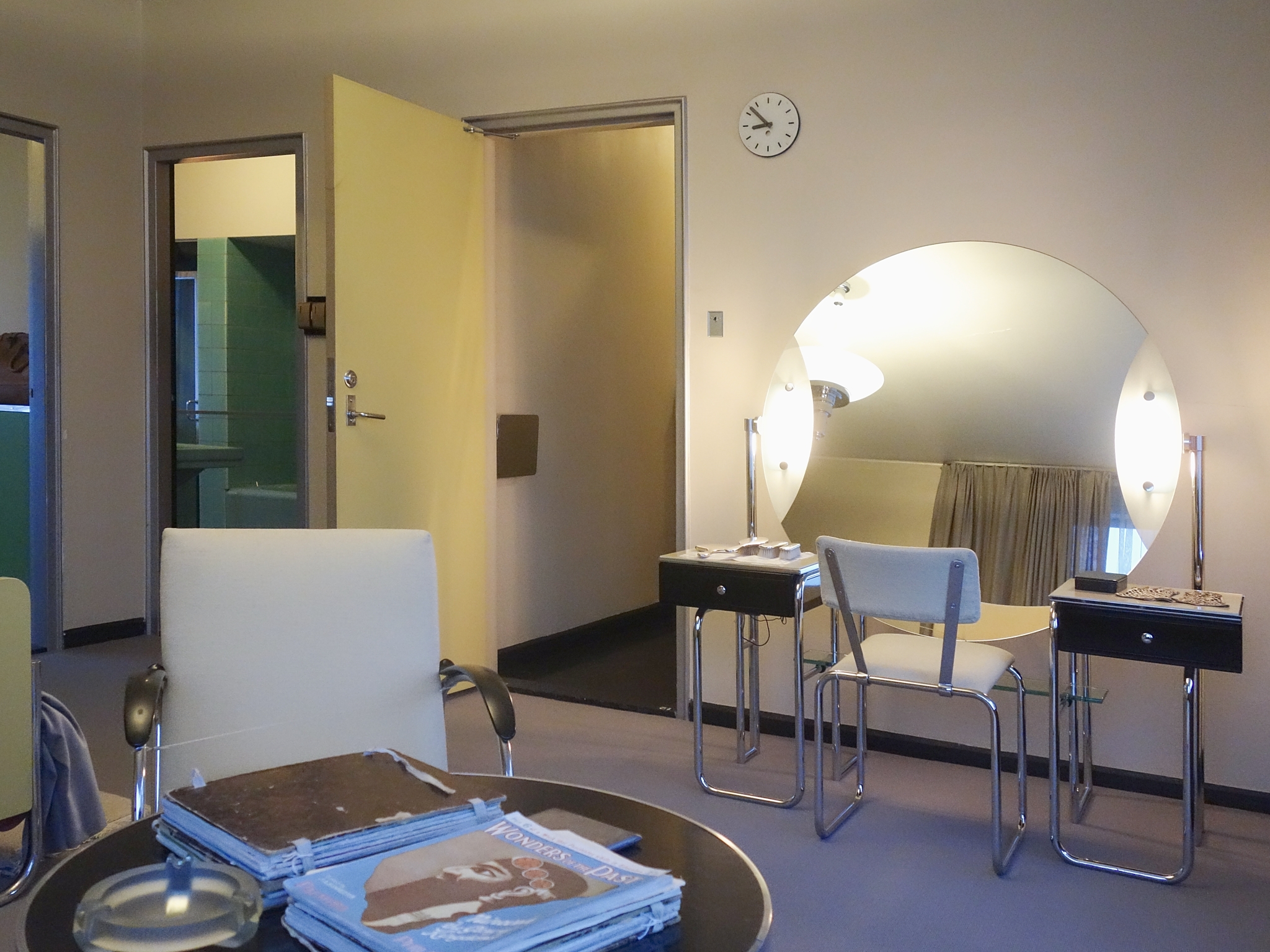
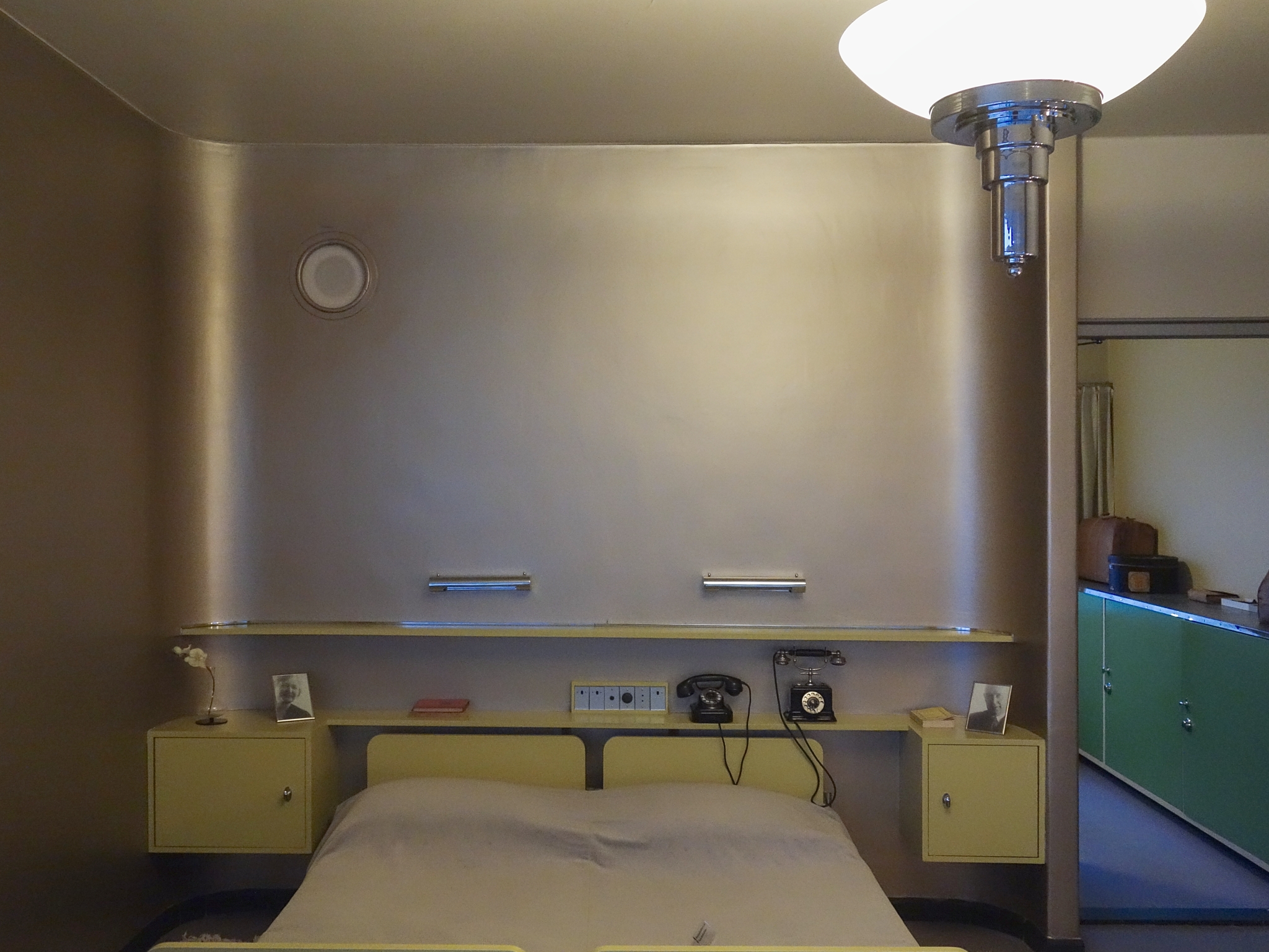
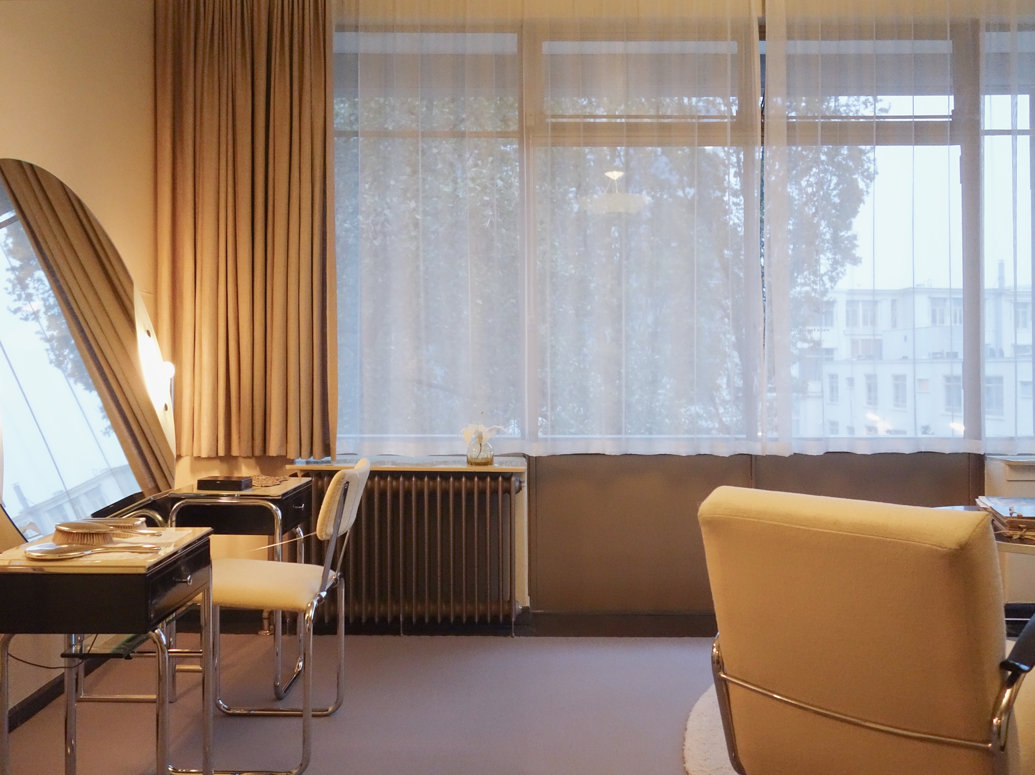
In the late 1920s, Albertus and Gésine Sonneveld commission architects Brinkman and Van der Vlugt to design a family home. The bureau had previously designed a factory for Van Nelle, where Sonneveld was director of the tobacco department. Inspired by his business trips to America, he has all kinds of technical gadgets installed, like a sound system for the entire house, a telephone network, a goods lift and a tenheaded massage shower. The result is an ultra-modern dwelling in the Nieuwe Bouwen or International Style.
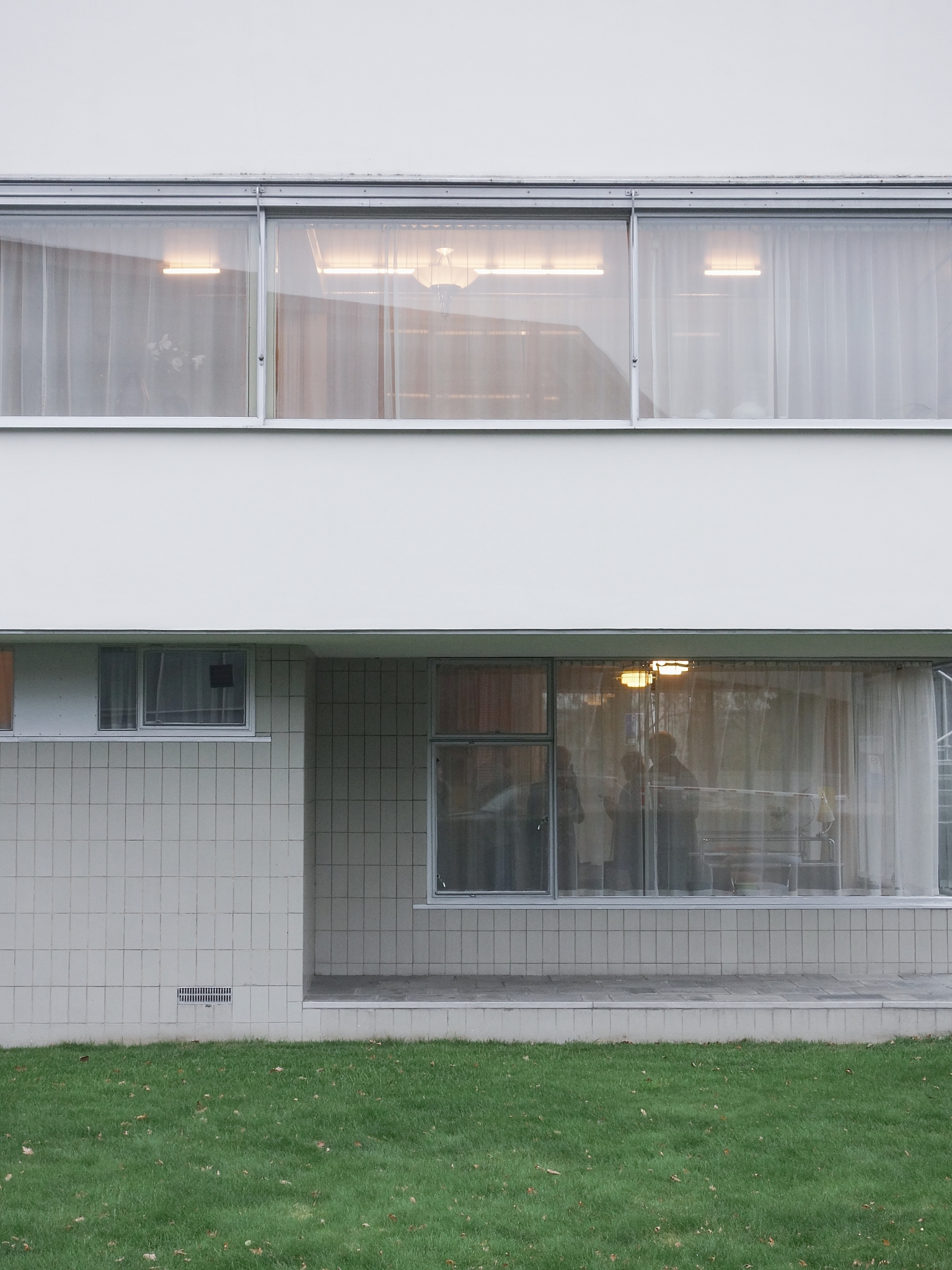
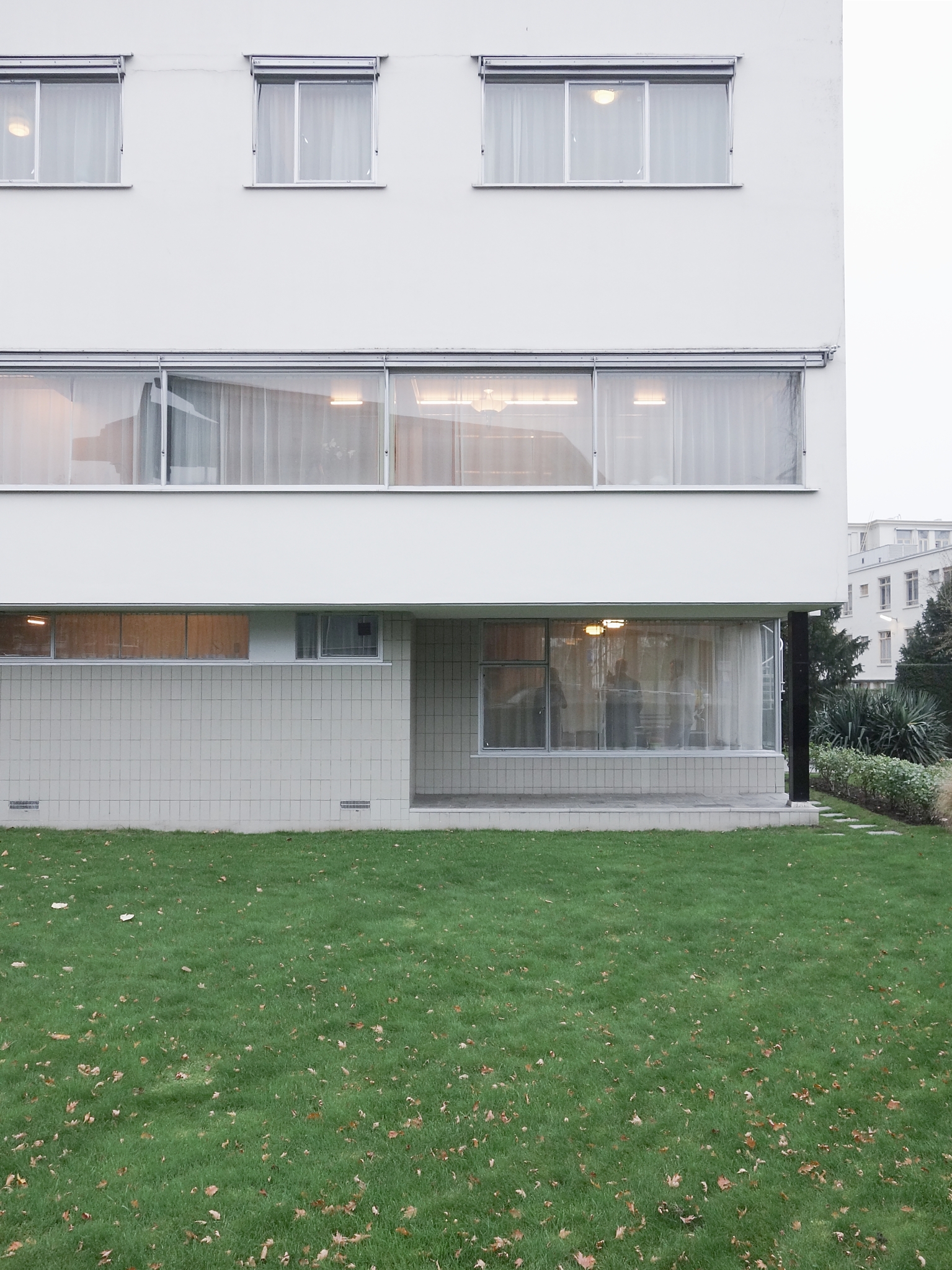
Sonneveld House adheres not only to the principles of Functionalism but also to the five points that Le Corbusier formulated in his book Vers une architecture (1921).
- Les pilotis: the core of the building stands on columns, free from the ground.
- Le toit-jardin: balconies and roof terraces form the transition between inside and outside.
- Le plan libre: the skeletal structure creates an open floor plan without loadbearing walls.
- La façade libre: the façades are not loadbearing and are a kind of ‘curtain’.
- La fenêtre en longeur: horizontal windows, preferably running the whole length of the façade.
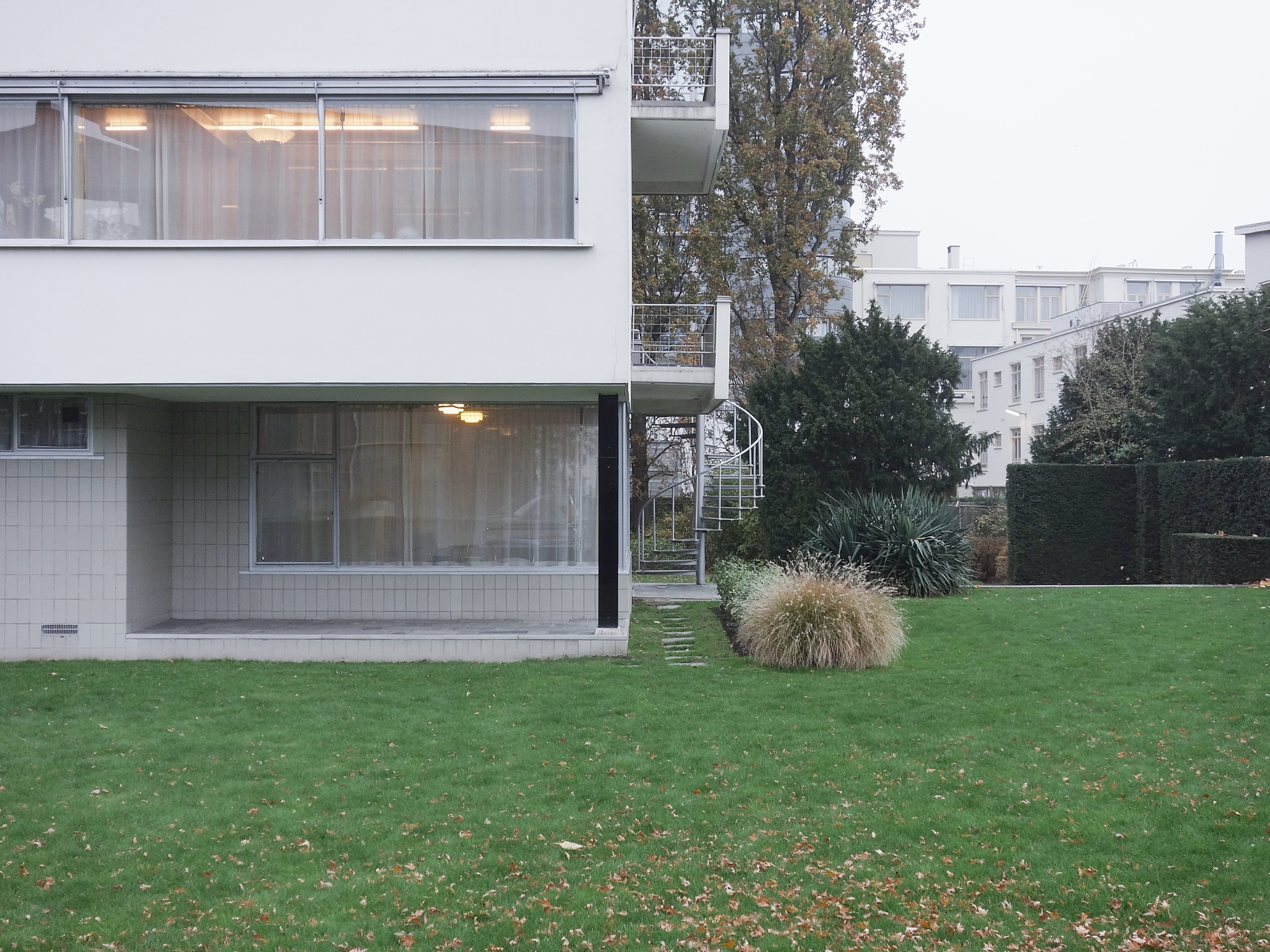
Villa Savoye (1930) at Poissy near Paris can be seen as Le Corbusier’s manifesto because it represents the most radical application of his five points. The building had a great influence on modernist architecture. All of Le Corbusier’s five points can be found to a lesser or greater degree in Sonneveld House: in the numerous external spaces, the open arrangement of the living room, the bands of windows running the entire length of the façade and the volumes raised on pillars. As in Villa Savoye, in Sonneveld House the servants’ quarters and the garage are on the ground floor with the principal living spaces above.
Albertus Sonneveld believed in Rotterdam's future as a port and cultural city, in commerce and the city's role in the world economy. The family were enthusiasts for efficiency, hygiene, comfort and luxury. They were keen on sports and took sporting holidays in the mountains. The architectural ethos of 'light, air, and space' fitted the family like a glove. Their new house, which they moved into leaving all their old furnishings behind, reflected their philosophy that you make your own future.
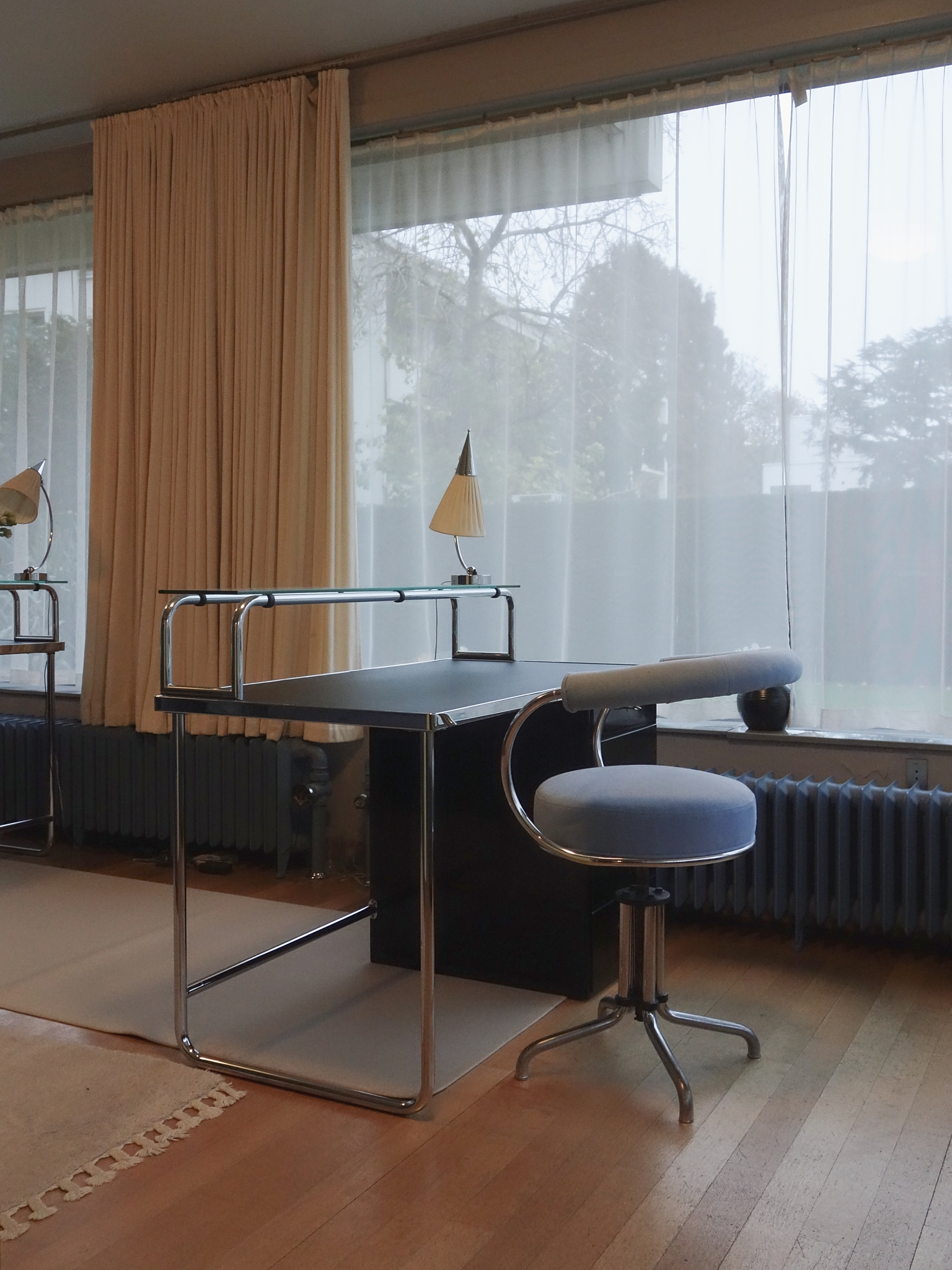
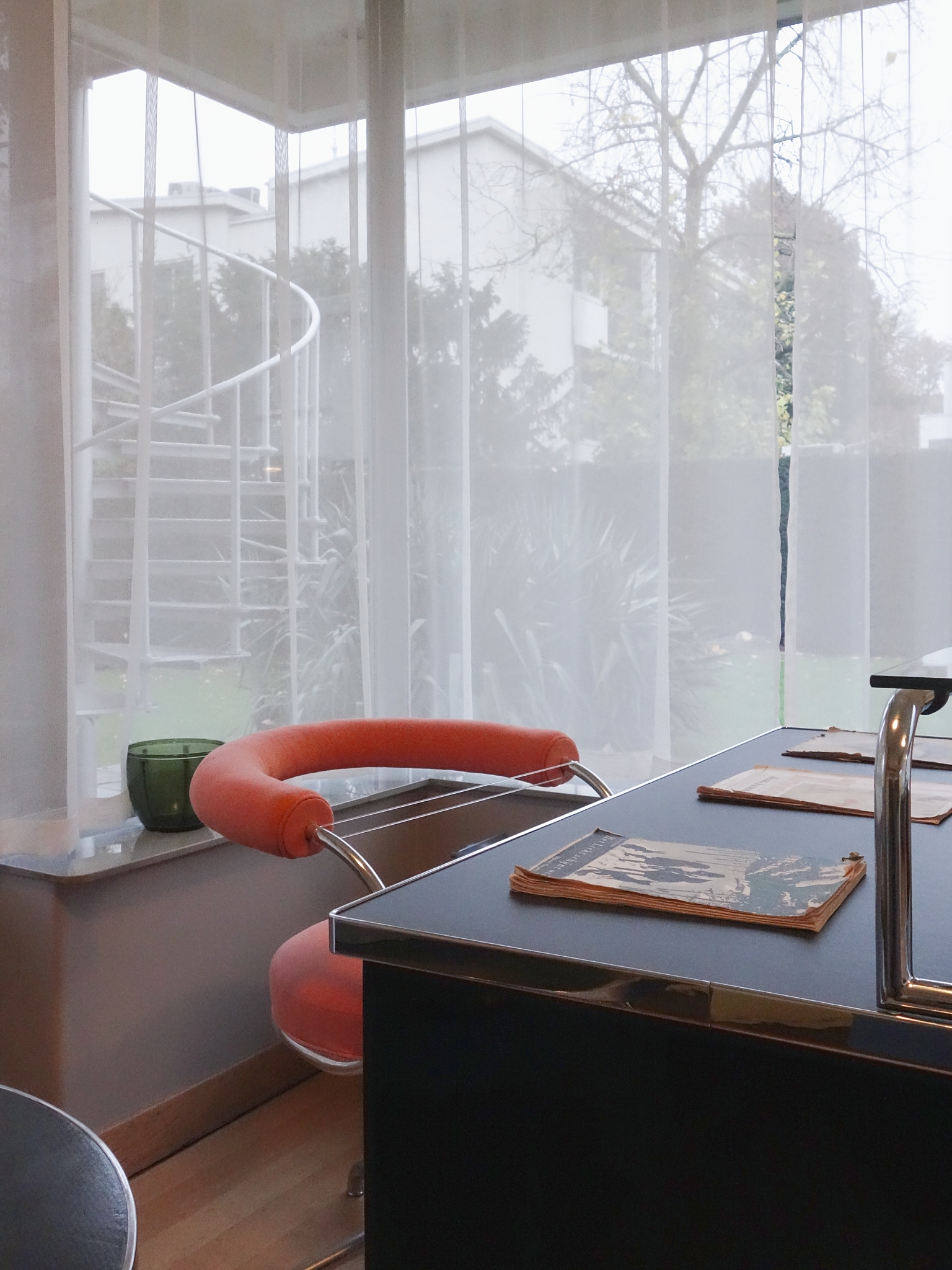
The chairs in the studio were chosen from a Gispen catalogue. Like the majority of the furniture and lamps in the house, they were mass-produced and delivered to the door. The family made a selection from Gispen catalogue no. 52, issued in 1933.
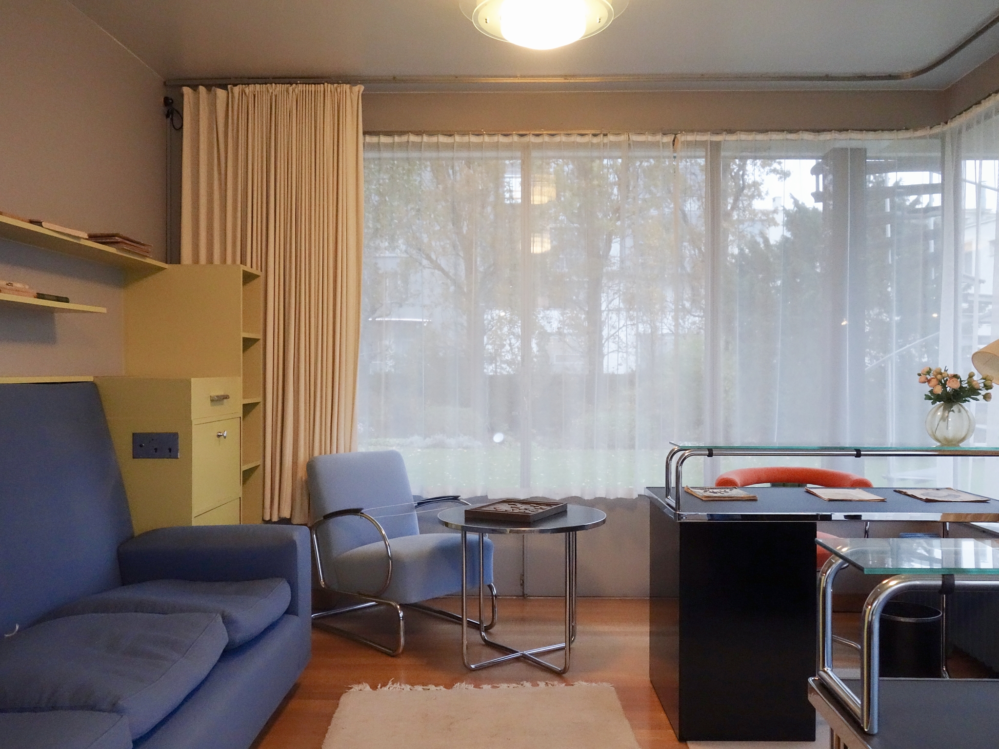
Sonneveld House functioned as an exemplary showcase for modern ideas about living. The family’s choice for hypermodern architecture and an interior with tubular-steel furniture was highly unusual in the early 1930s. Tubular-steel furniture was already widely used in offices and hospitals but not in receptions or boardrooms and certainly not in domestic settings, where heavier, wooden furniture still dominated.
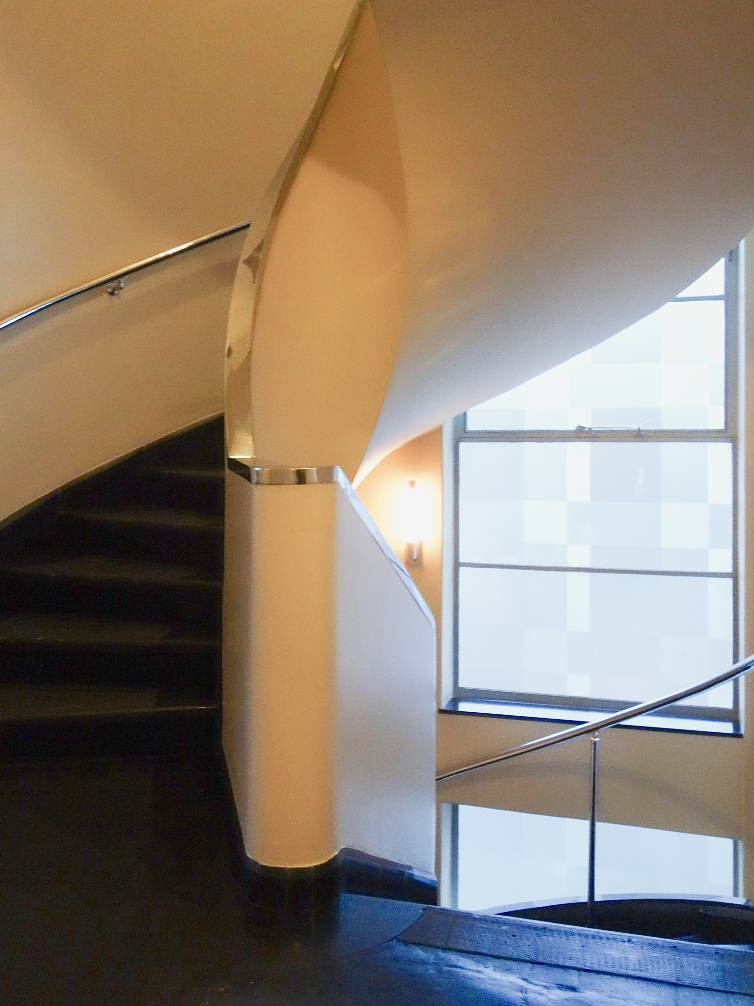
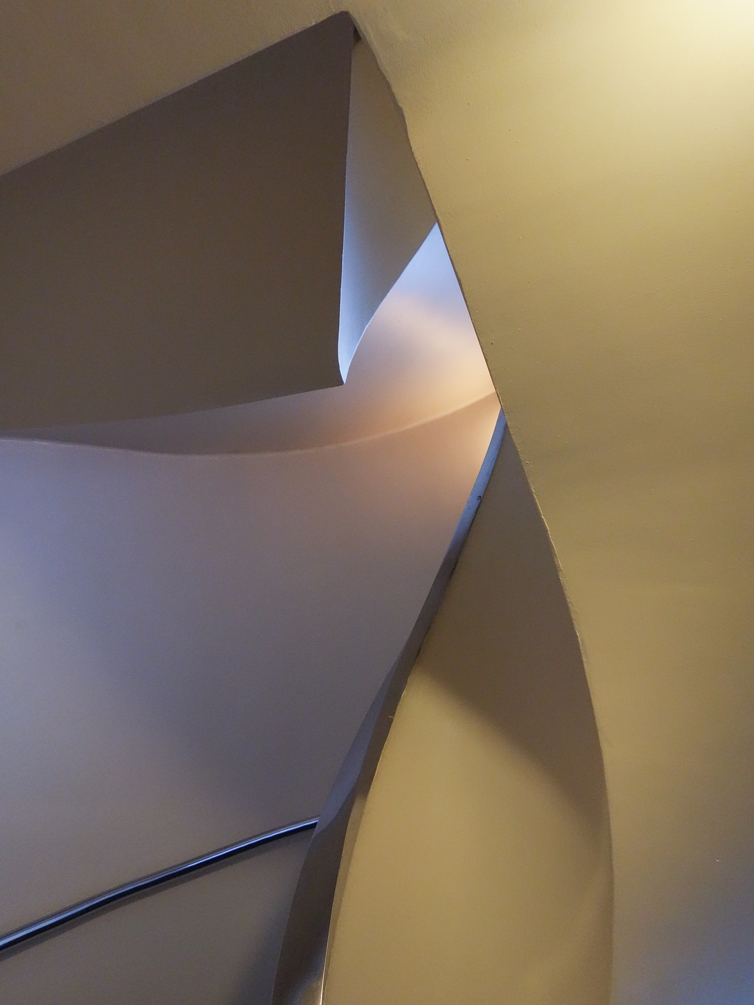
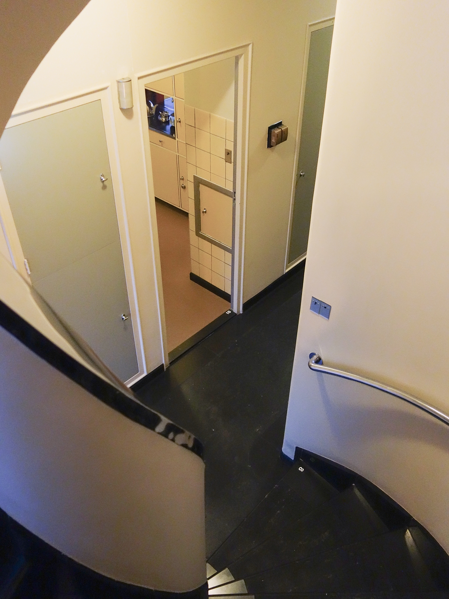
The staircase winds like a screw through the entire house. The steps are covered with black marble – actually ‘Namur stone’ from Vinalmont near Liège – and strips of rubber to dampen the sound. The construction is best appreciated from the first floor. The central axis is open and the glistening chrome-plated bannisters have the effect of festive serpentines guiding the form. The incoming light is diffused beautifully by the frosted windows, in which a pattern of squares and rectangles is etched.
Sonneveld House has a steel skeletal structure and concrete floors, enabling it to dispense with loadbearing walls, thus allowing the spaces to be divided with greater freedom. Walls were used only to separate spaces. To create optimal openness and flexibility, on this floor the architects opted to divide the spaces with sliding panels and curtains rather than fixed walls. In this way it was possible for the living room to stretch across the entire length of the house. The bands of windows running the full length of the building admitted a sea of light. When required, the sliding wall provided more privacy. For example, in the evenings Mr Sonneveld closed the library off from the living room and used it as a smoking room.
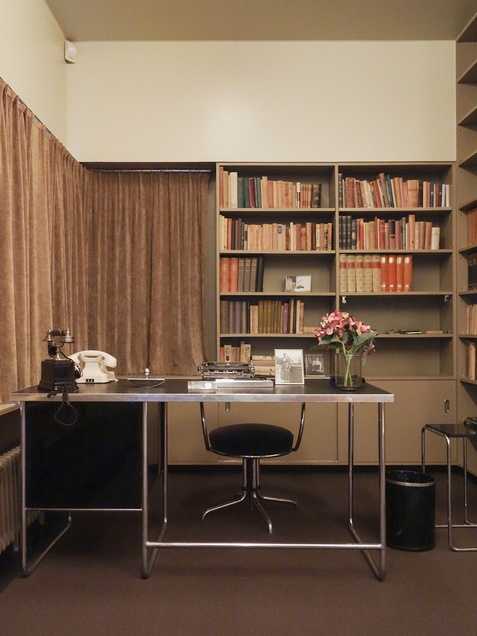
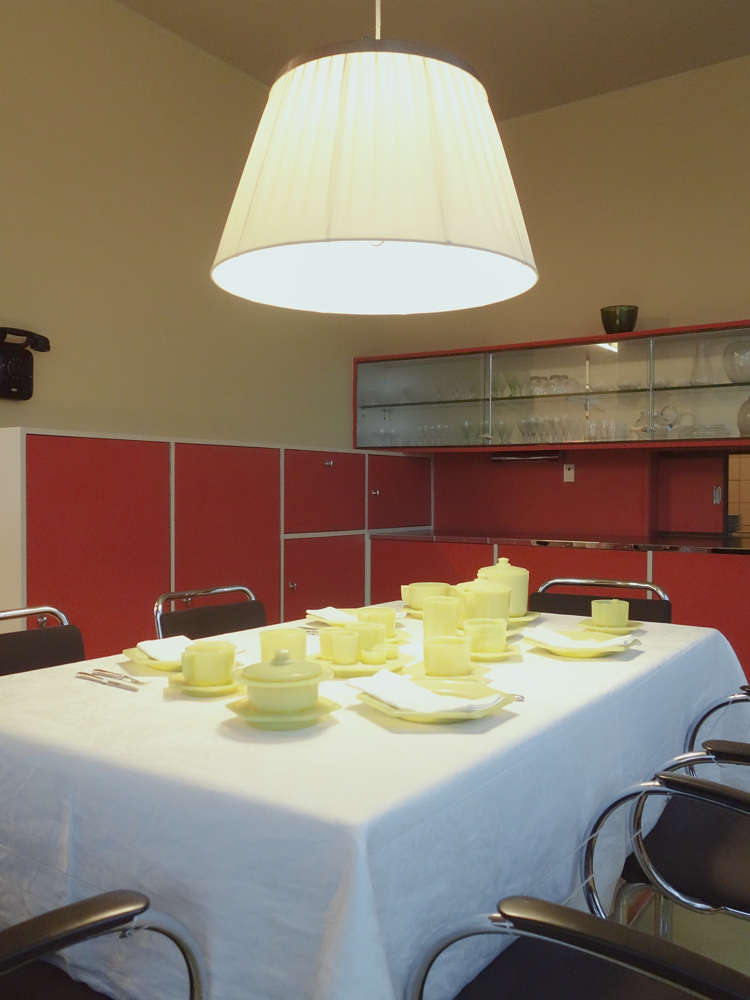
The intrinsically detailed interior is designed to match in every way, yet it also makes a broad statement. Each room has a specific atmosphere and color scheme. Art, windows, upholstery and furniture are by leading designers and suppliers, such as Bart van der Leck, John Raedecker, Metz & Co, Jungerhans and Glasfabriek Leerdam. Gispen, a major manufacturer of lamp and furniture ranges, supplied the family with products made to order. Applied art in this period was influenced by North African designs. The Sonnevelds personally visited the factory in Morocco where their Berber carpet was woven.
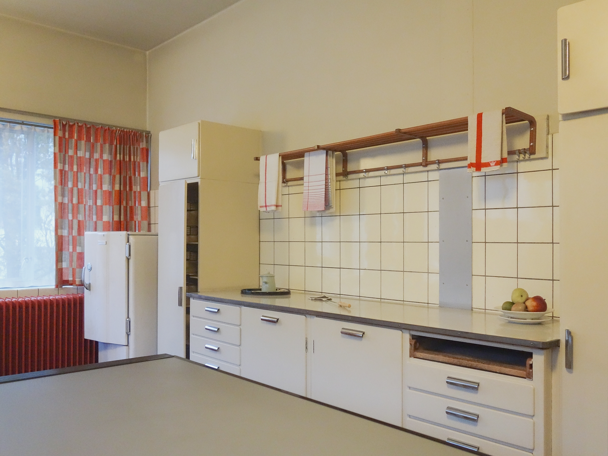
In 1931 the Netherlands Association of Housewives commissioned architect J.W. Janzen to design the ‘Holland Kitchen’, the Dutch response to the ‘Frankfurt Kitchen’ (1926) of Margarete Shütte-Lihotsky. The design provided a minimal walking distance and the best natural lighting for the most common activities such as cooking and washing up and it employed standard measurements. It was not until 1936 that Bruynzeel commissioned architect Koen Limperg to design kitchen elements that were suitable for manufacture. It eventually fell to the designer Piet Zwart to design the kitchen, which employed a large number of standard elements. Key design criteria were ease of fabrication and installation. The kitchen was put into production in 1937 and was installed in Sonneveld House in the same year.
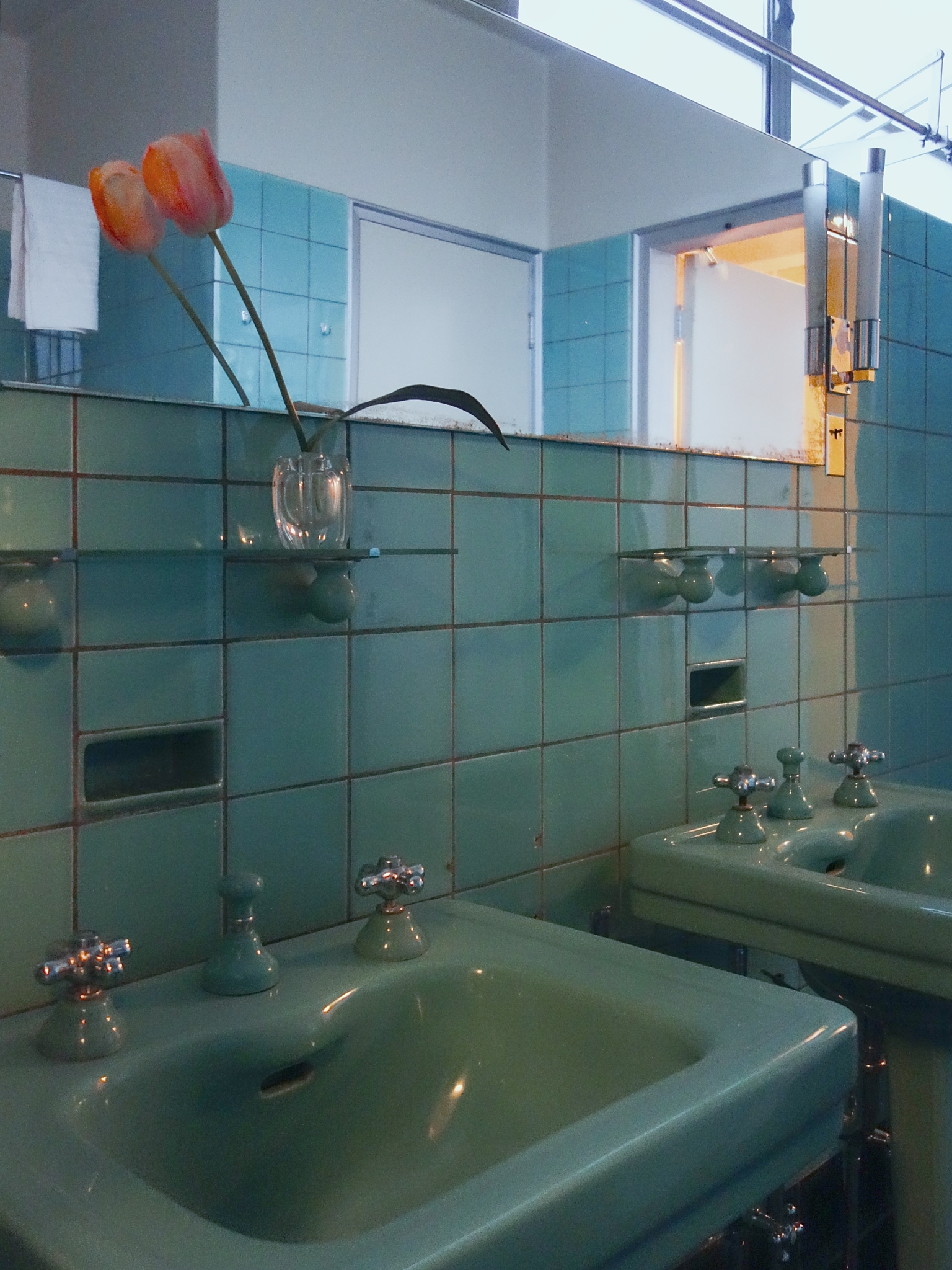
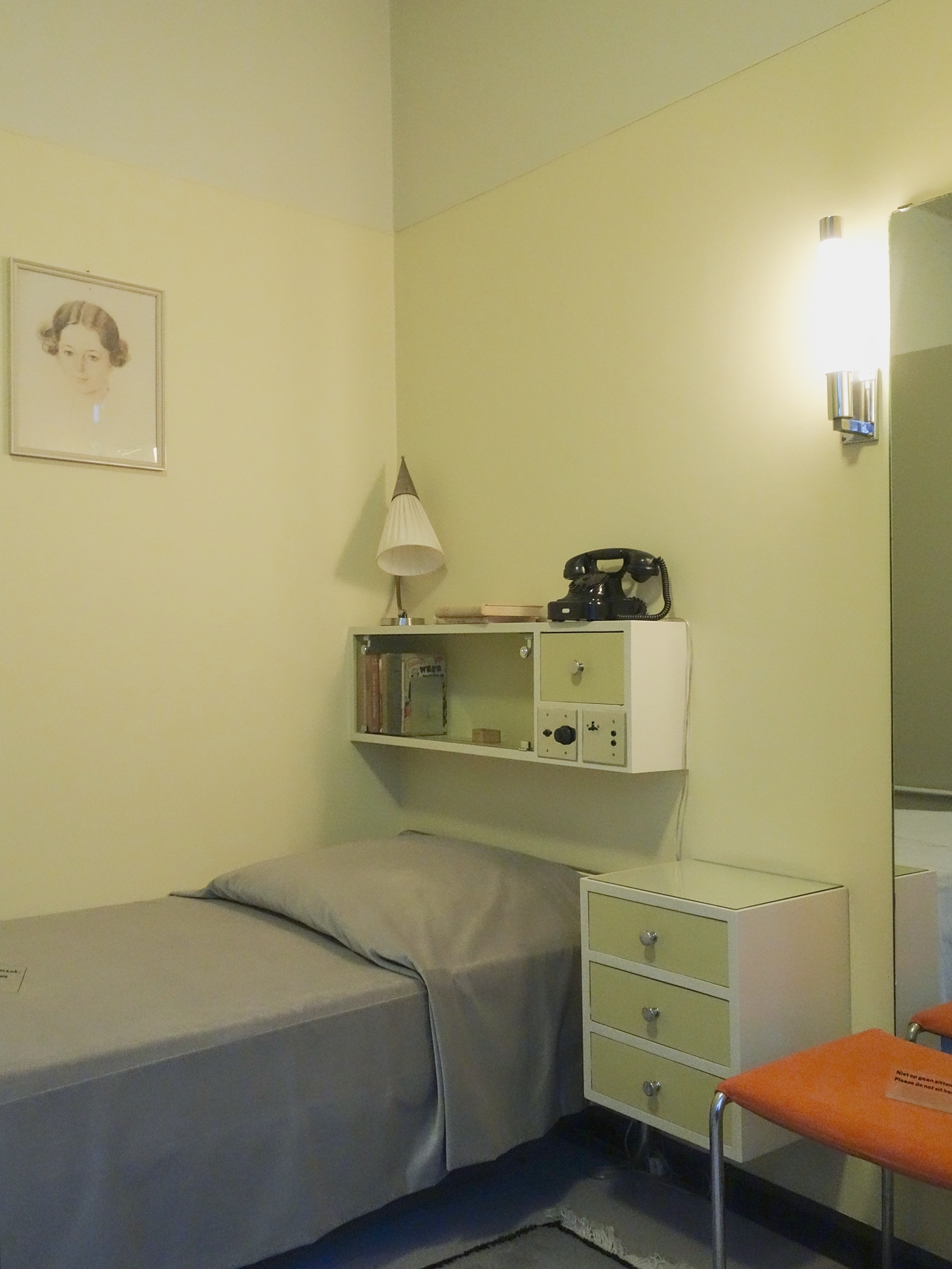
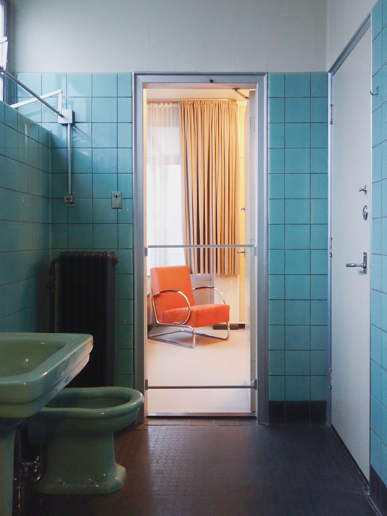
The daughters Puck and Gé shared a bathroom, located between their two bedrooms. The turquoise wall tiles in the girls’ bathroom are also to be found in the Van Nelle factory, of which their father was a director. It is possible that leftover tiles were used for the bathroom, but it is more likely that Albertus Sonneveld liked this colour so much that he wanted to have it in his own house too. The same tiles also feature generously in his own bathroom on the next floor up. The floor tiles are conspicuous for their convex and concave profiles: this style was already rather old-fashioned in the 1930s.
Linoleum was an integral part of Functionalist architecture. It is hygienic, easy to maintain and lies flat and even, without lumps or bumps. At the beginning of the 1930s linoleum was quite expensive. It was used in hospitals but not in private houses. It was therefore a great luxury to have it in the guest bedroom, the serving room and in both servants’ rooms. Dark-brown linoleum was also planned for the parents’ bedroom but eventually a warmer and more luxurious woollen carpet was chosen.
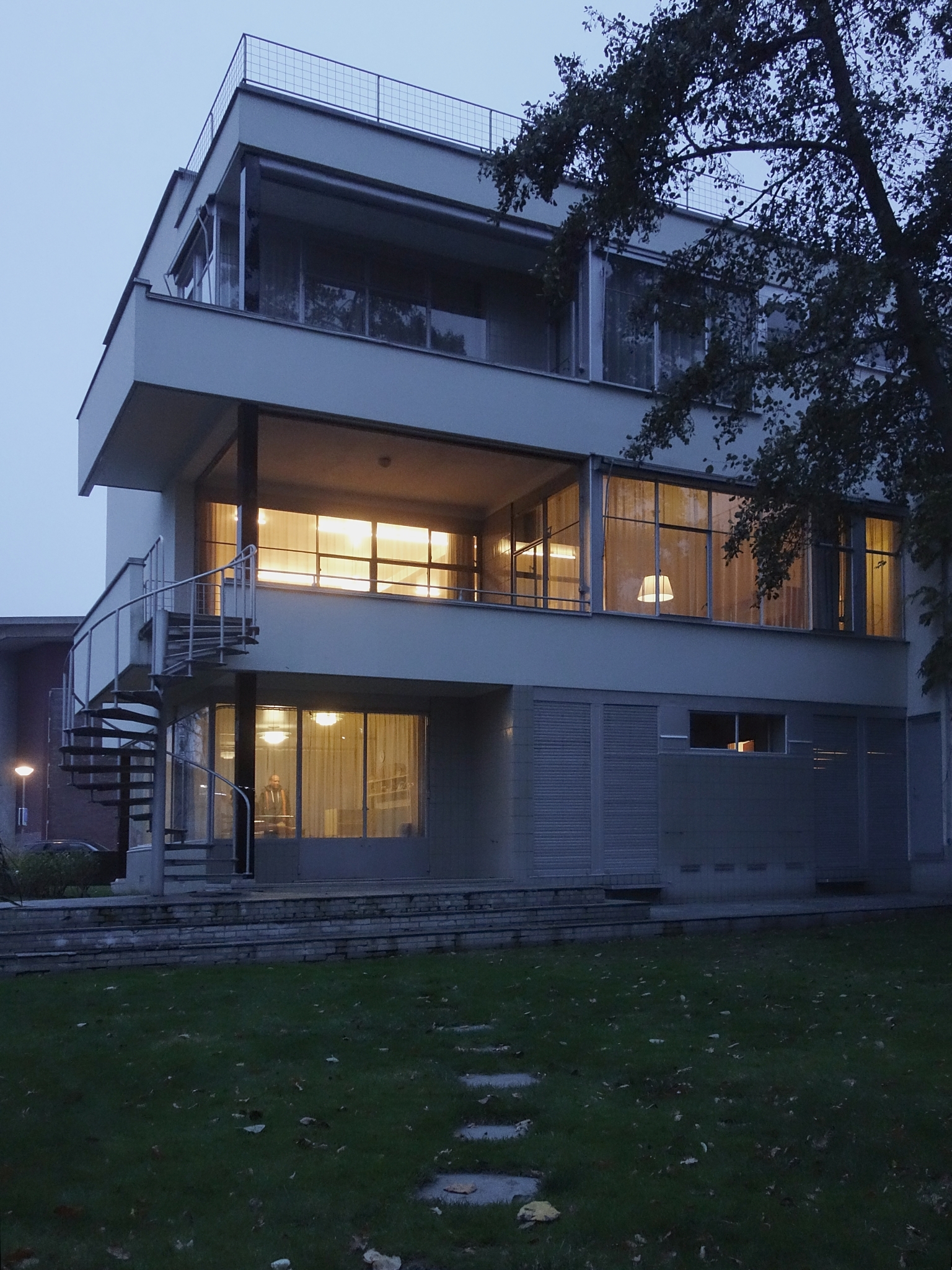
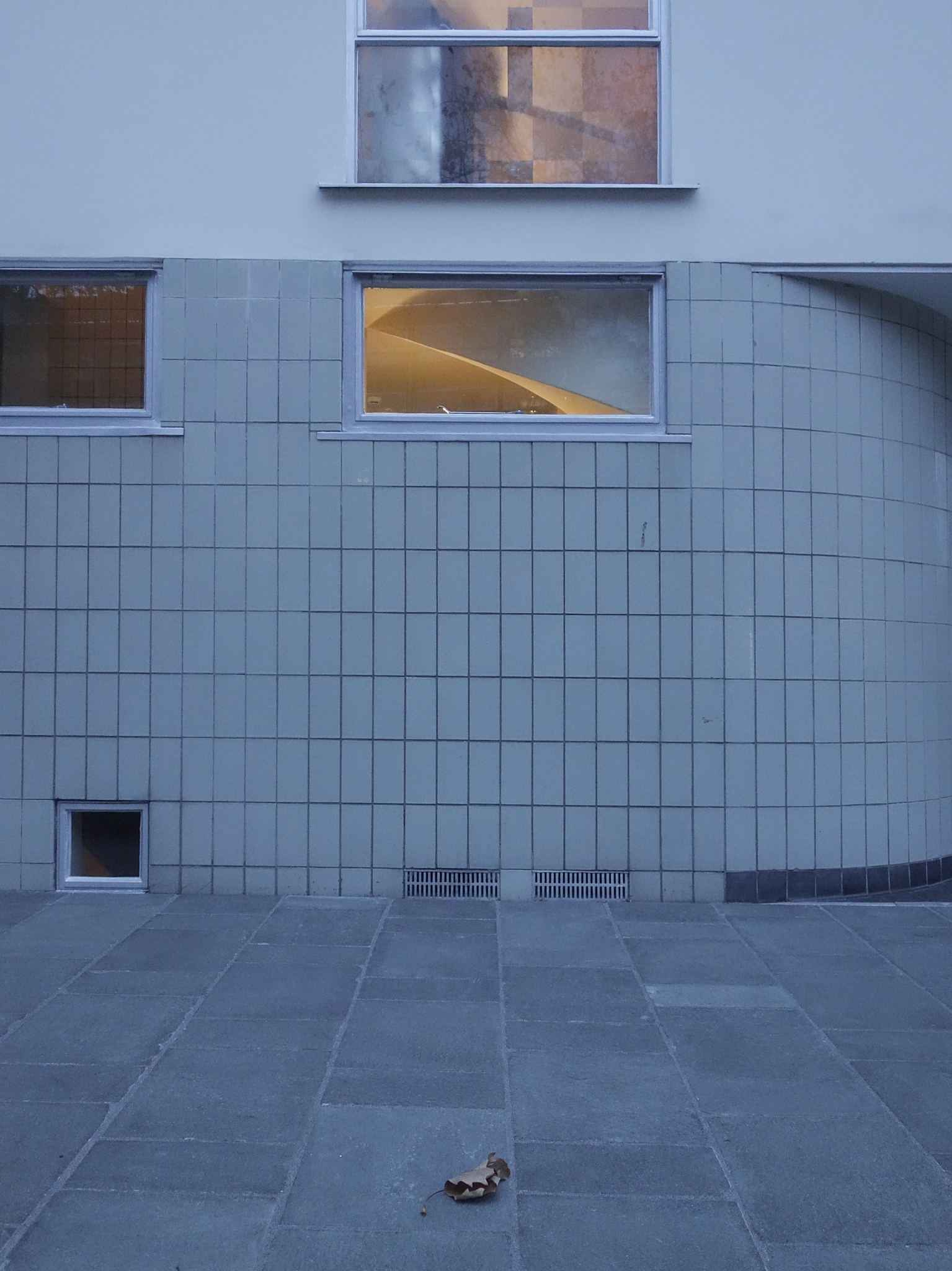
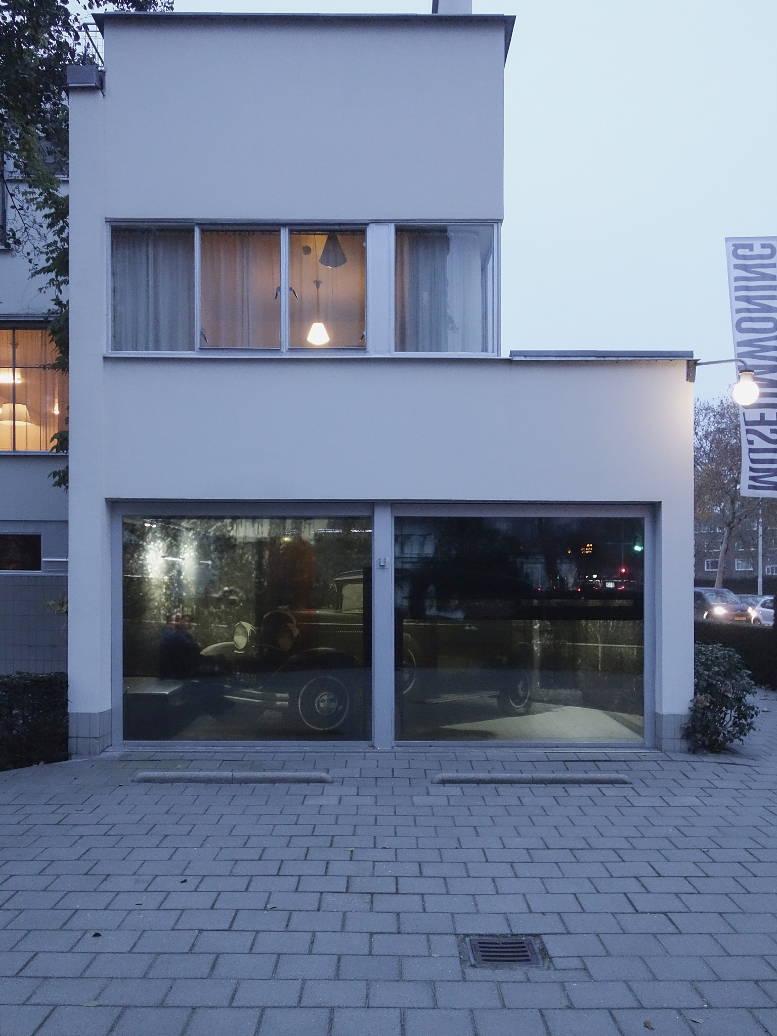
Brinkman en Van der Vlugt were among the first architects in the Netherlands to design a garden that complemented their Functionalist building design. The clean lines of Sonneveld House are echoed in the design of the garden. The building’s rectilinear massing is mirrored in the form of the terraces and hedges. The design was shaped by ideas about a healthy lifestyle and outdoors activities: the balconies, roof terrace, veranda and garden allowed for intensive use of outdoor spaces for fresh air, sun, games and relaxation.
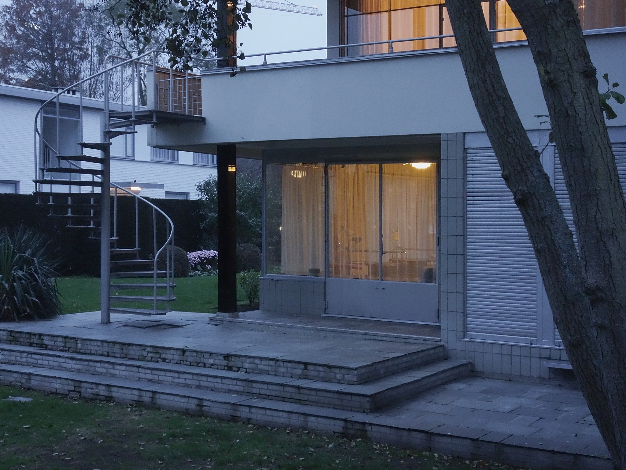
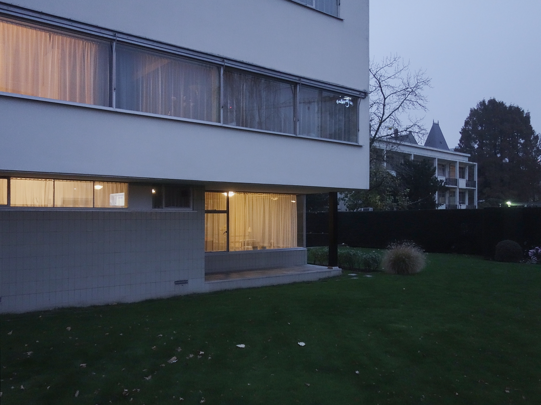
The ‘public’ part of the garden, visible from the street, consisted primarily of lawn and cleanly trimmed evergreen hedges. This part of the garden had a relatively static design with crisp horizontal and vertical lines. The garden to the east of the retaining wall was intended for private use and was therefore separated from the entrance and driveway. It was slightly lower and had a more dynamic design with softer lines. Areas of low planting gradually fused with higher plants and the lines of the hedges were softened here and there with overgrowing plants.
